All posts by Sandra Dolby

A Valentine for the Teacher

We have looked at the cover art of The Handel Letters, and I have talked a little about why I chose to have illustrations at the head of each chapter. I’ll say more about those illustrations at another time and also explain the subtitle of the book—A Biographical Conversation. I warned you that I would be moving through the book from beginning to end, picking out things to comment on in this blog. So here I would like to say more about the page that follows the title page and the copyright and ISBN information—the dedication page.

There you learn that the book is “dedicated to the memory of Mr. Cloyde Slater and to all who have worked to keep Handel and his music alive, in our ears and in our hearts.” Thankfully, there are many, many people who have over the years kept Handel’s music alive, but I chose to mention one particular person—Cloyde Slater, my high school choir teacher and the director of the community chorus in my home town of Huntington, Indiana. Since this is Valentine’s Day, this is my little valentine to the teacher—just like those special “for my teacher” paper valentines always included in elementary school packages.

Cloyde Slater was a small man who always wore a suit. He had a good sense of humor and, obviously, a great deal of patience or he would never have lasted as a high school choir teacher. He served as organist and choir director at the Bethel United Methodist Church in Huntington until he died in 1993. He was born in Huntington in 1912, attended Manchester College, earning a BA in Music, and taught for many years at Huntington High School. During the 1960s and 1970s he directed the community chorus as it offered the annual performance of Handel’s Messiah. That was how I came to love Handel’s music—through Cloyde Slater’s inspiring instruction and leadership.

But he did much more for me than introduce me to Handel. I was a good student in high school, particularly enjoying the science classes, French, and literature. But my one extra-curricular or fun subject was choir. It met every day, and I enjoyed it immensely. I also sang with the Swing Choir and the Girls’ Sextet. In the context of daily choir practice, Cloyde Slater taught me nearly everything I know about how to sing. Because I was basically shy, it was both a challenge and a blessing to be required to sing—out loud—every day. I don’t believe I could ever have become a teacher and stand in front of a classroom if I had not learned first to sing with some confidence in front of other people. So, I have much to thank Cloyde Slater for.

I was in high school during the early 1960s, graduating in 1965. It was the folksong era, and I was a fan of Joan Baez and Judy Collins. The seeds were sewn for a later interest in folklore, obviously. My senior year Cloyde Slater asked me to sing a solo at our final concert. I had taught myself guitar, and I was both thrilled and scared to take the stage alone. But I made it through the concert—sang “Where Have All the Flowers Gone?” for my dad—one of his favorites. I also tried my hand a writing a few songs. I’ll attach one here that I wrote then—”Last Barrel Down.” I sometimes wonder what in the world was in my head as an 18-year-old. Ah well, I hope you enjoy it. Some friends helped me put it on a record (you know, vinyl) while I was at college. I called the album First Time Ever—how original, right? In any case, thanks, Cloyde Slater, for introducing me to Handel and for encouraging me to sing.
The Norwegian Tales: My Inspiration for Including Illustrations

The Norwegian Tales: My Inspiration for Including Illustrations

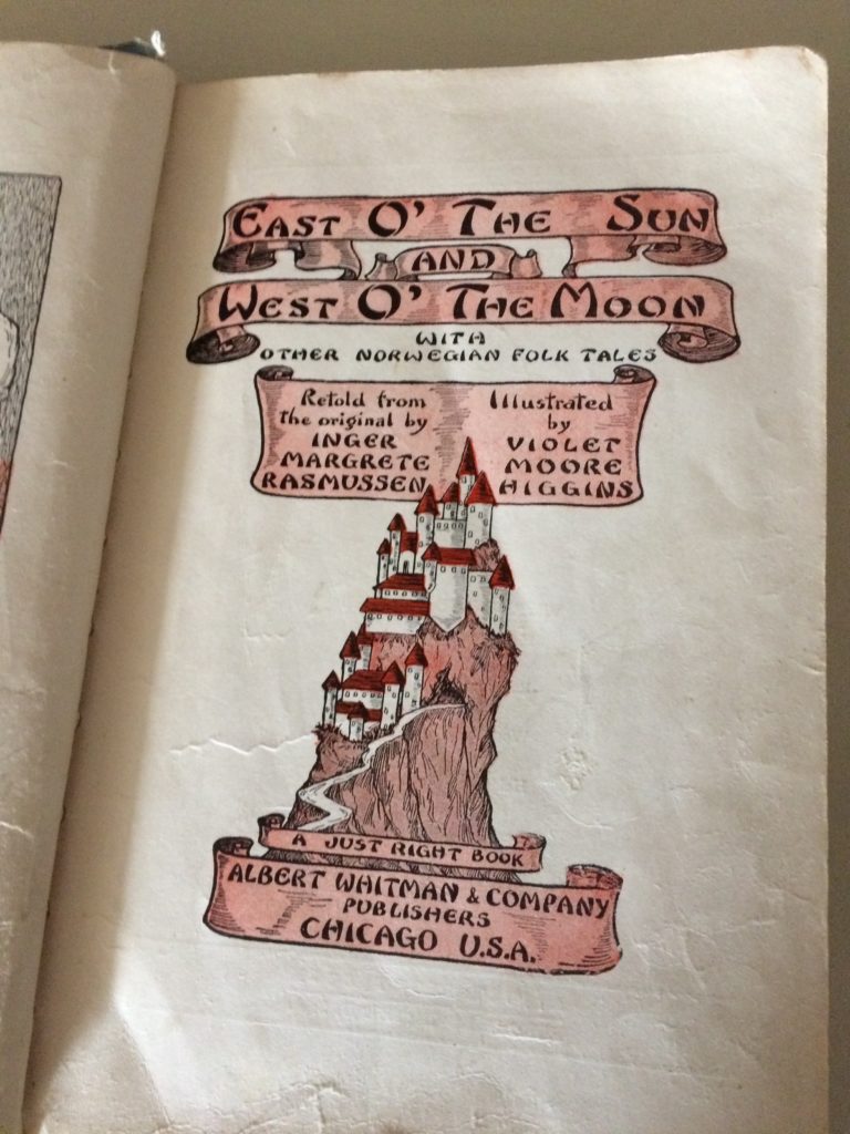
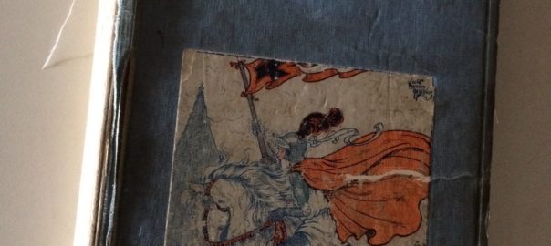
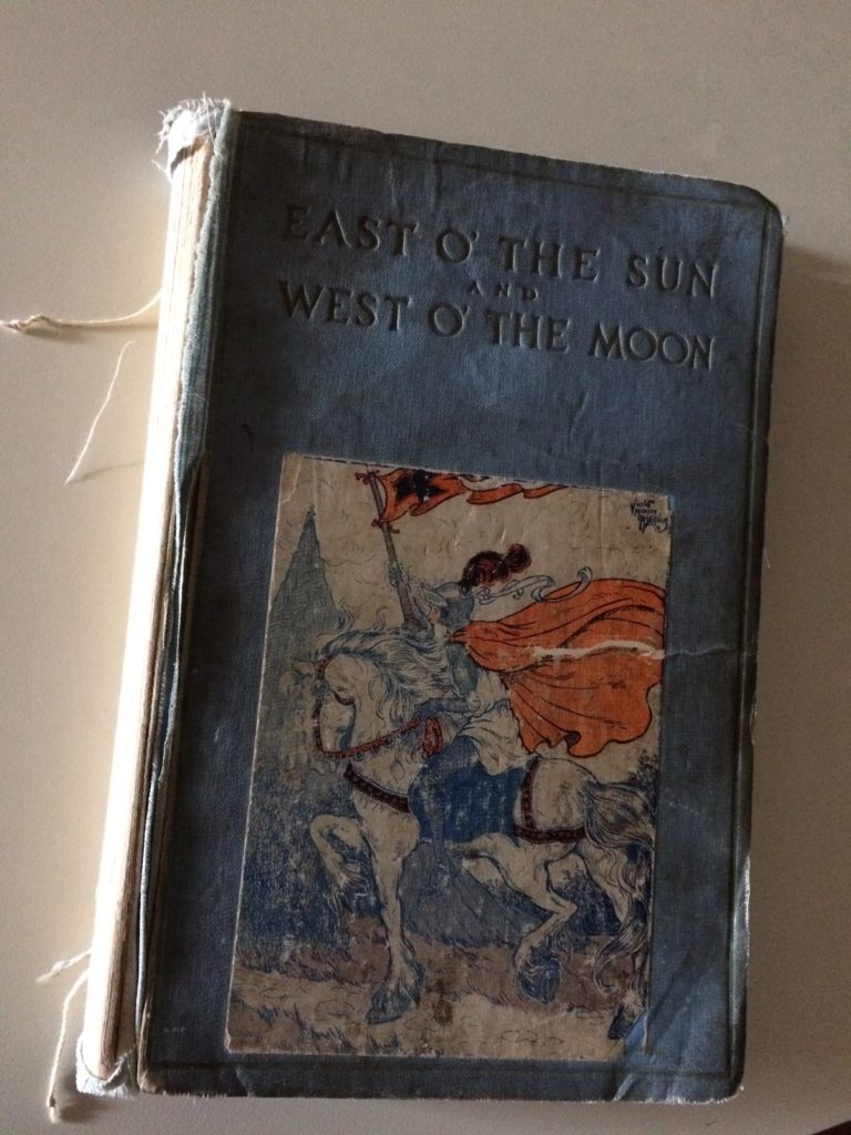
Last time I shared the fact that I had asked my daughter to create the illustrations that grace the chapter heads and the cover of The Handel Letters. Here I would like to say a little more about what prompted me to have illustrations in the book. The reason flashes back to my childhood. I was lucky enough to live right next door to my grandmother, Gertrude Dolby. I spent countless hours just messing around with whatever she found for me to do—sitting on her porch swing as she shelled peas or pitted cherries, reading old letters from my Aunt Mary, or listening as she read the poems of James Whitcomb Riley or from other books. Among her books was one I came to love above all others. It had belonged to my older cousins, Ruth and Rosemary Hull, but for some reason, it stayed in Indiana with my grandmother when my cousins moved to California. The book was a collection of fairy tales, East o’ the Sun and West o’ the Moon. Even then, it showed extreme signs of heedless handling by children, but I still have it, I’m happy to say. Here is a photo:

The book was the Third Edition of the title, published by Albert Whitman & Company of Chicago, and copyrighted in 1924. Though clearly based on the collection of Norwegian tales, Norske Folkeeventyr, published in 1843-1844 by Peter Christen Asbjørnsen and Jørgen Moe, the book does not reference this source. Instead, the stories are noted to be “retold from the original” by Inger Margrete Rasmussen, though it isn’t clear whether the “original” refers to the Norwegian or English text. Such disregard for sources was fairly common in children’s books. The earliest English translation of the tales, by George Webbe Dasent in 1859, did acknowledge the Norwegian source, but Dasent’s translation was intended as a scholarly work, inspired by translations of the Grimms’ folktale collection. My beloved but battered version was meant for children.

As you can see, the illustrator was a woman named Violet Moore Higgins. She was an American artist working in the early 1900s, primarily in children’s book illustration, but she also produced a comic book character, Drowsy Dick. You can find out a little more about Moore at the following website:

www.lambiek.net/artists/m/moore-higgins_violet.html

I have always liked the pictures in the Rasmussen/Higgins book. And I can’t help noticing that both the translator and the illustrator of that book were women. Though we don’t know whether the 19th-century oral storytellers were men or women, we do know that the better-known Dover edition of the Norwegian tales was clearly the work of men: two Norwegian collectors, one British translator, and several well-known Norwegian artists. Primary among those 19th-century Norwegian artists were Theodor Kittelsen, Erik Werenskiold, and Per Krohg. These artists are still revered as national treasures in Norway. I was impressed to find, during my year in Norway, that some of the illustrations from the tales were found on such common products as shampoo packets in hotel rooms. Norwegians love their stories (and their artists).

Though Violet Moore Higgins’s illustrations hold a special place in my heart, I do very much appreciate the selection of seventy-seven illustrations reproduced in the 1970 Dover edition of the Norwegian tales. Consider two Illustrations by Theodor Kittelsen drawn to illustrate the story titled “The Twelve Wild Ducks,” a version of ATU type 451. (See www.atlasobscura.com/articles/aarne-thompson-uther-tale-type-index-fables-fairy-tales for a discussion of Types of International Folktales.) Usually the type involves seven brothers transformed into ravens, but here it is twelve brothers transformed into ducks. Many of Kittelsen’s works are available at this address: https://commons.wikimedia.org/wiki/Category:Theodor_Kittelsen.

Both drawings convey some cultural data along with representing aspects of the plot. You see some material culture of the time—the girl’s dress, the log house with sod roof), some sense of place (the wet meadow with thistles, the hilly landscape). Generally the illustrations from the original Norwegian collection were of this sort—realistic and skillfully executed representations of plot elements. Imagine how wonderful it was to have such visual accompaniments to the stories before the days of photography, video, and film. Including illustrations in children’s books is still a wonderful endeavor—thus the coveted Caldecott Award. But for my own book—a book for adults rather than children—I wanted something more like a reference or allusion to something in each chapter.

When I talked with my daughter about this idea, she suggested that what I really wanted was something more like an icon that recalls some motif in the text. As a folklorist, my association with the word icon was the pictures or three-dimensional figures of saints often used in religious ritual. Two colleagues recently published a study of people who create such pictures and sculptures in Brazil. See:

www.amazon.com/Sacred-Art-Catholic-SaintsCandomble/dp/0253032059/ref=sr_1_1?s=books&ie=UTF8&qid=1518362380&sr=11&keywords=Sacred+Art%3A+Catholic+Saints+and+Candomblé+Gods+in+Modern+Brazil

But Alexis said that she meant something more like the emoji or icons so often used online these days. The images are more sketchy and symbolic rather than realistic and culture-specific. I realized that there were in fact a few drawings of that sort in the Rasmussen-Higgins collection of my childhood. As Alexis said, these were simply easy reminders of some part of the story, not really the weightier kind of imagery conveyed through an illustration. One example from Violet Moore Higgins was this one recalling for the reader a motif in the story of “The Lad Who Fooled the Troll and Won the Princess,” or ATU 328. The lad used a nail, at twig, and a candle to fool the troll into thinking he was cutting the lad’s finger.

So, we decided to have such evocative icons as pictures heading up each chapter. More about a few specific drawings later. Thanks for stopping by.

Book Covers and Illustrations

Books and Illustrations

February 6, 2018

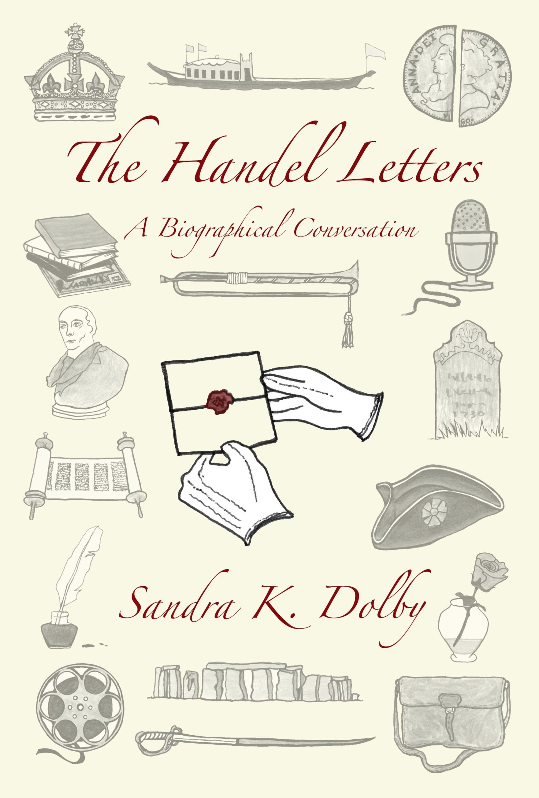
I will guess that the first thing you will notice about The Handel Letters: A Biographical Conversation is the cover. I opted for the matte finish paperback cover, and I am glad I did. It feels and looks good—a good choice, I think. CreateSpace has various templates for covers, and Mr. Humphrey, in his CreateSpace for Beginners, discusses these templates, admitting that he uses them 95% of the time. Such cookie cutter covers were one thing I really wanted to avoid in creating my book, so I chose to ask my daughter, Alexis Stahl, to create the cover and upload it to the CreateSpace site. This was one of the last things done before giving CreateSpace the go-ahead for publishing, but as the cover is likely the first thing readers will see, let me comment on it here.

Alexis Stahl has a BA in Art from Tulane University (Newcomb College) and an MFA in Art from the University of Cincinnati. Files for the front, back, and spine of the Handel book were hers to design and adapt to the required sections and pages on CreateSpace’s website. Of course, she ran everything by me beforehand, but I was so glad to turn that task over to her. Quite aside from the technical skills involved in uploading the files correctly, her real challenge was in creating the drawings that would serve as chapter head illustrations and as images arranged on the cover of the book. Using some of the pictures from the book interior on the cover was her idea, and I think it was an excellent one.

I will talk another time about some of the individual chapter head illustrations, but for now I want to draw your attention to how she created a pleasing and meaningful collage as a front cover. There needed to be a certain amount of symmetry, with images of similar shape and size lined up on either side and down the middle. In the middle there are long, horizontal figures, and on either side there are images of roughly similar shape and size included opposite each other. Prominent, in the center, and in bolder print, is a thematically important drawing of a pair of white- gloved hands holding an old-fashioned sealed letter. The seal is in red and matches the only other red-colored writing on the cover—the title and author’s name. Against a cream-colored background, all of the grey-toned drawings suggest ideas to be found in the book and simultaneously create a pleasing picture in and of themselves. I applaud Alexis on creating a unique and attractive cover.

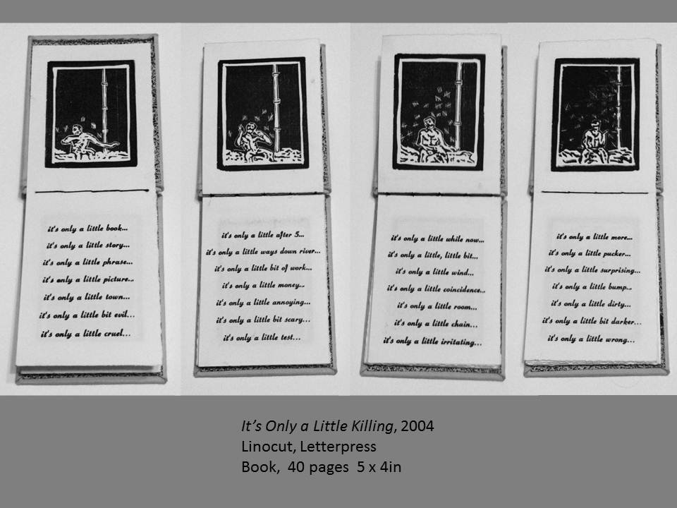
You might wonder what kind of art background would be influential in leading to the cover Alexis created. I am pretty sure much of the creativity that went into creating the cover is simply part of my daughter’s natural talent coming to the fore—no undue maternal pride there, right? However, you will find it interesting, no doubt, to know that her specialization in studying art was in printmaking. I have nearly twenty of her prints of various sorts—abstract, realistic, or thematic—framed and displayed upon my walls.   But I have one of her artworks that clearly underscores the skill and aesthetic perspective necessary for creating the cover of the Handel book. And that is a small hand-made book Alexis created some few years ago—a hand-stitched book, 4.5 inches by 8.5 inches, with a black cloth cover and marbled inside and end papers. She agreed to let me share with you a page from the book, but please do respect her ownership of the image. It is, after all, part of a larger unique piece of art. Here is the page I’ve chosen to share:

I plan to write more about book illustrations next time and to consider the genre or category that seems most appropriate for The Handel Letters. Meanwhile, thank you for dropping by.